Home
>
Selected work
>
Krunchbox is a SaaS platform that helps brand tenants turn large volumes of retailer POS data into clear, actionable insights for sales and inventory decisions.
Product
SaaS platform - retail analytics
Users
Brand tenants (Brand owners)
Role
UX Lead
Timeline
1 Month

Krunchbox

A powerful platform under growing complexity

Krunchbox aggregates weekly POS data across retailers, regions, and categories.
Krunchbox consolidates retail POS data across retailers, regions, and categories into a single decision-making platform.

Background

How organic growth introduced complexity

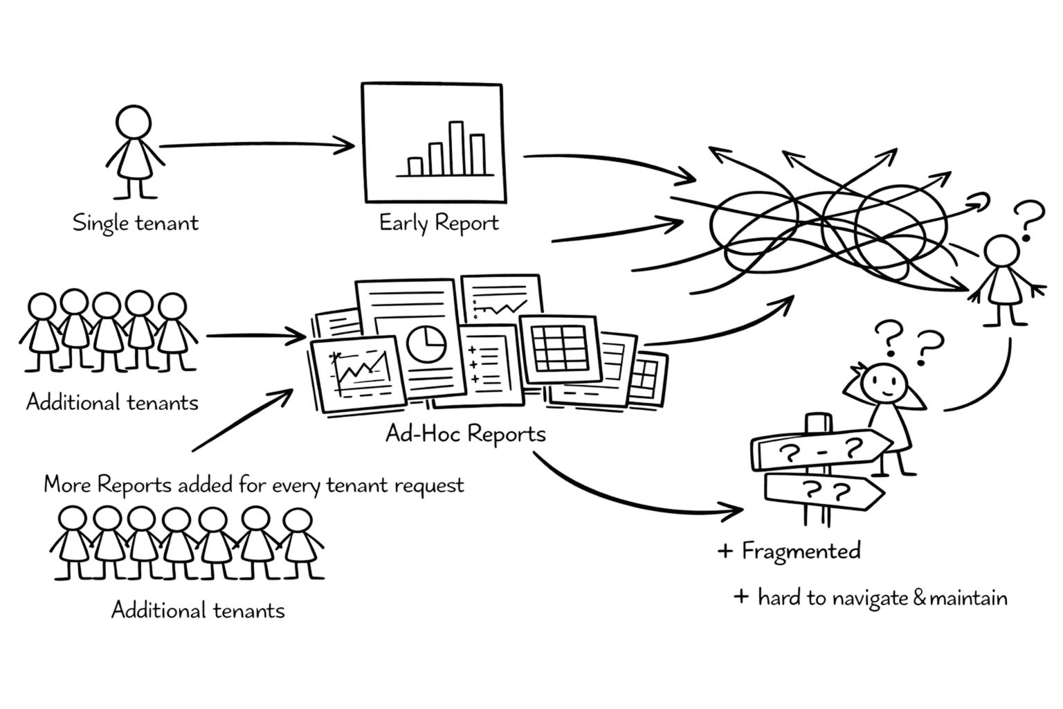
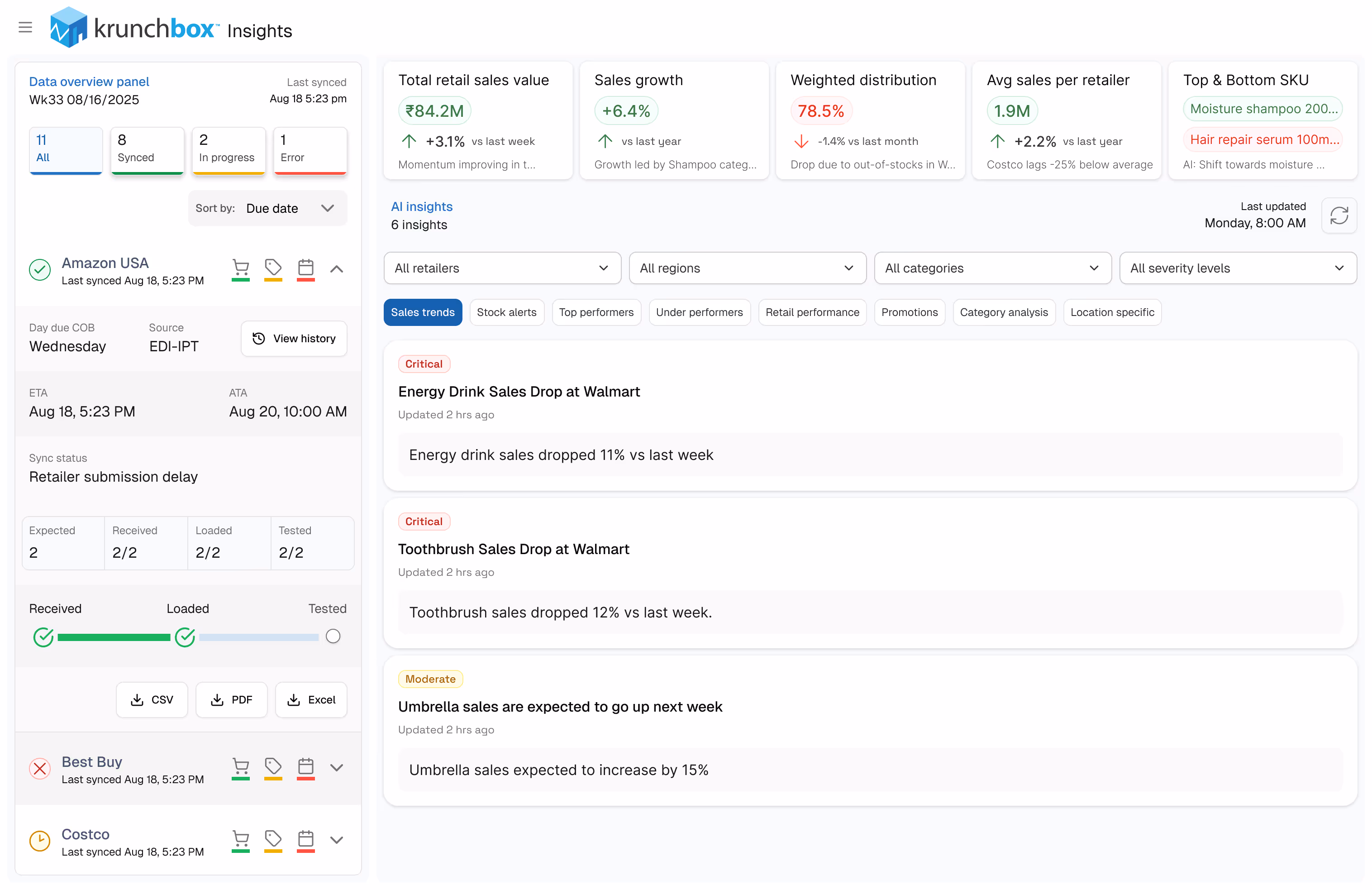
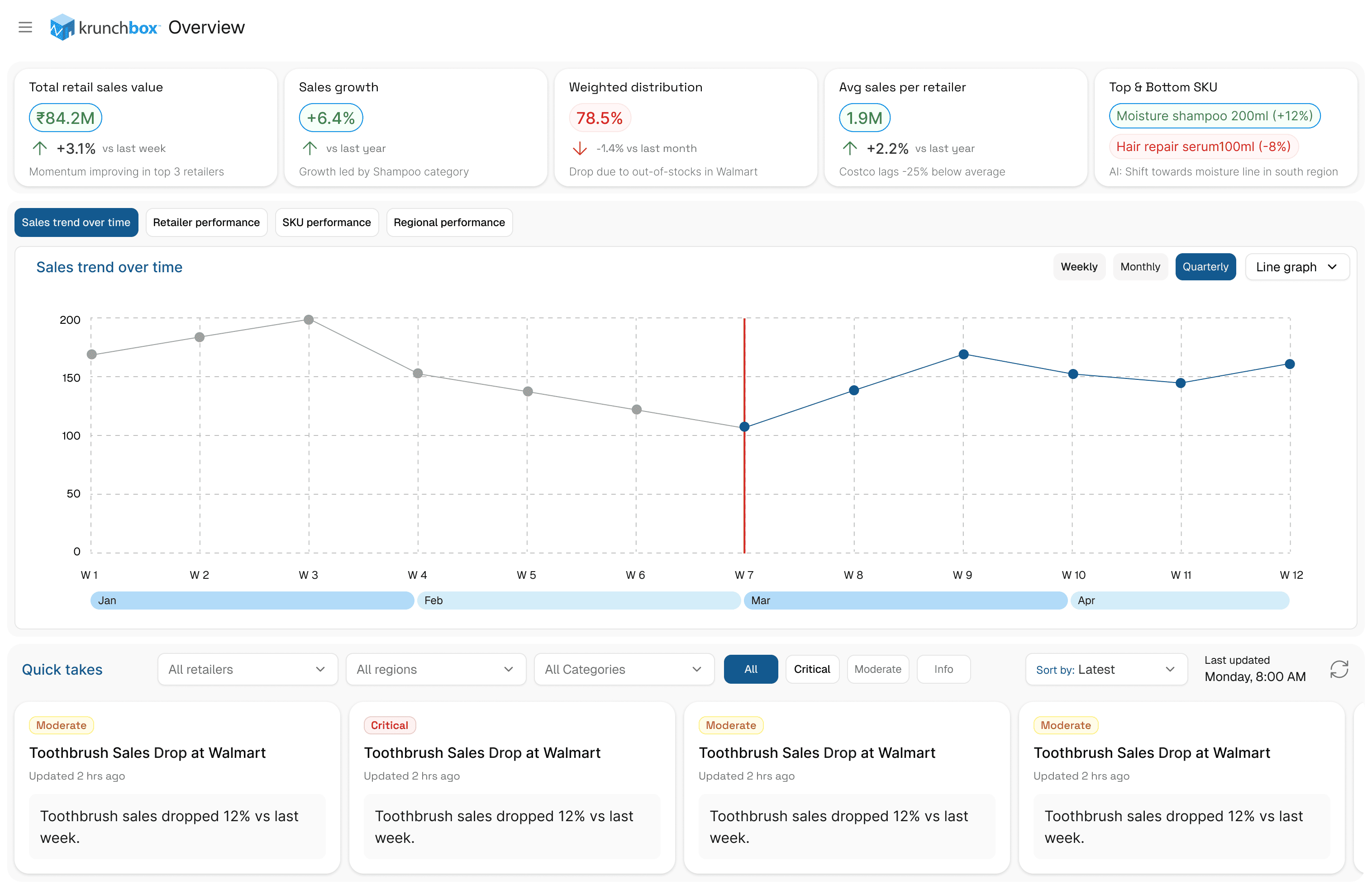
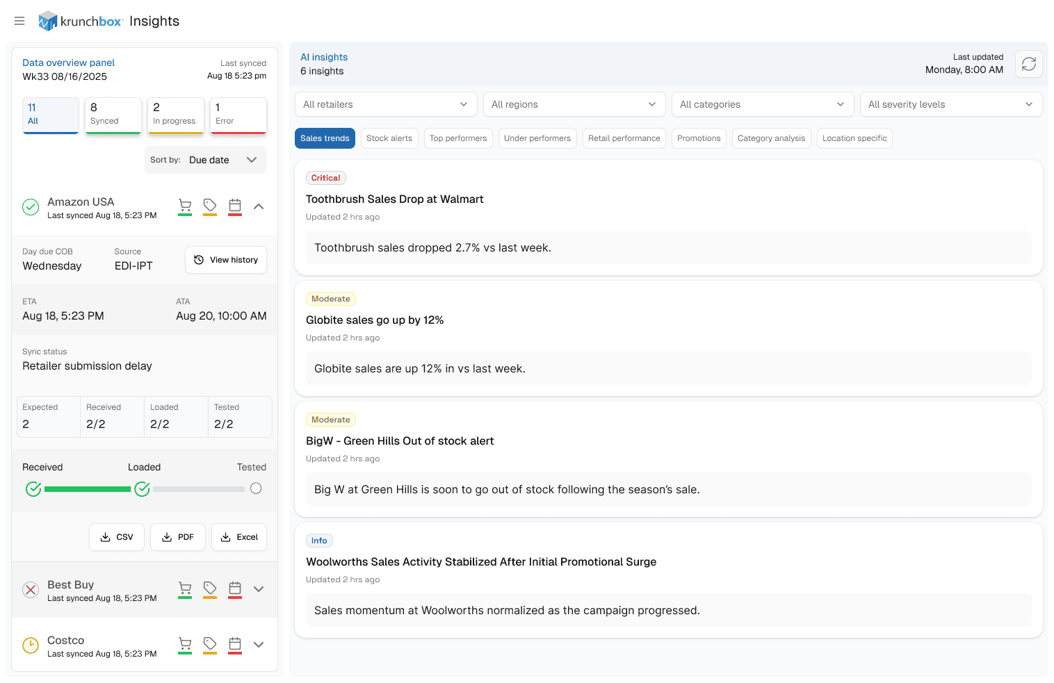
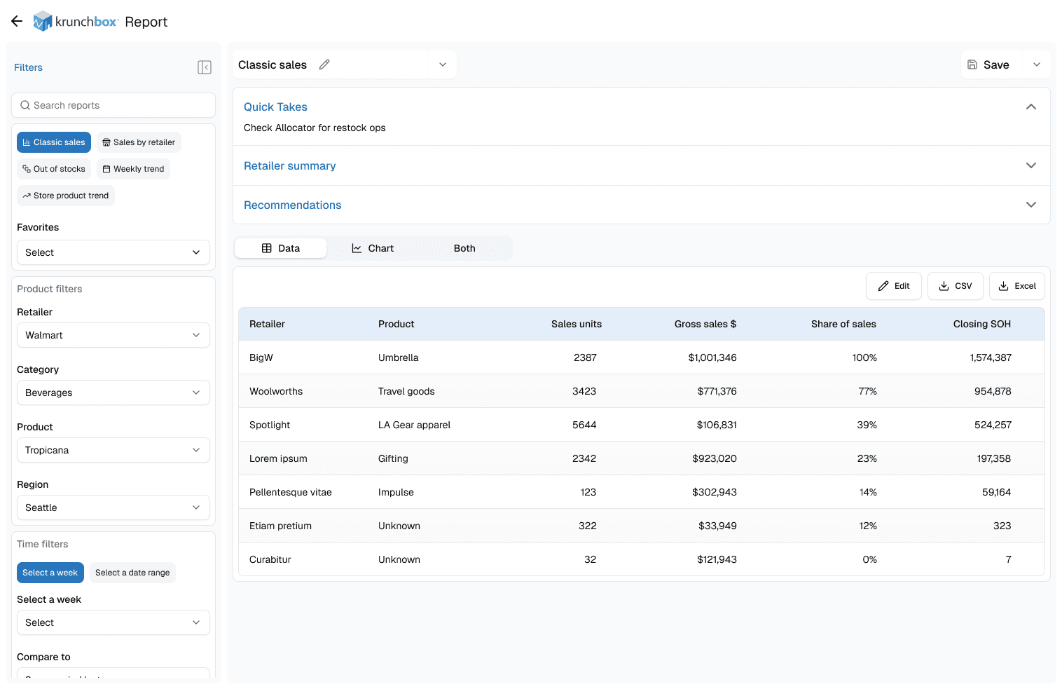
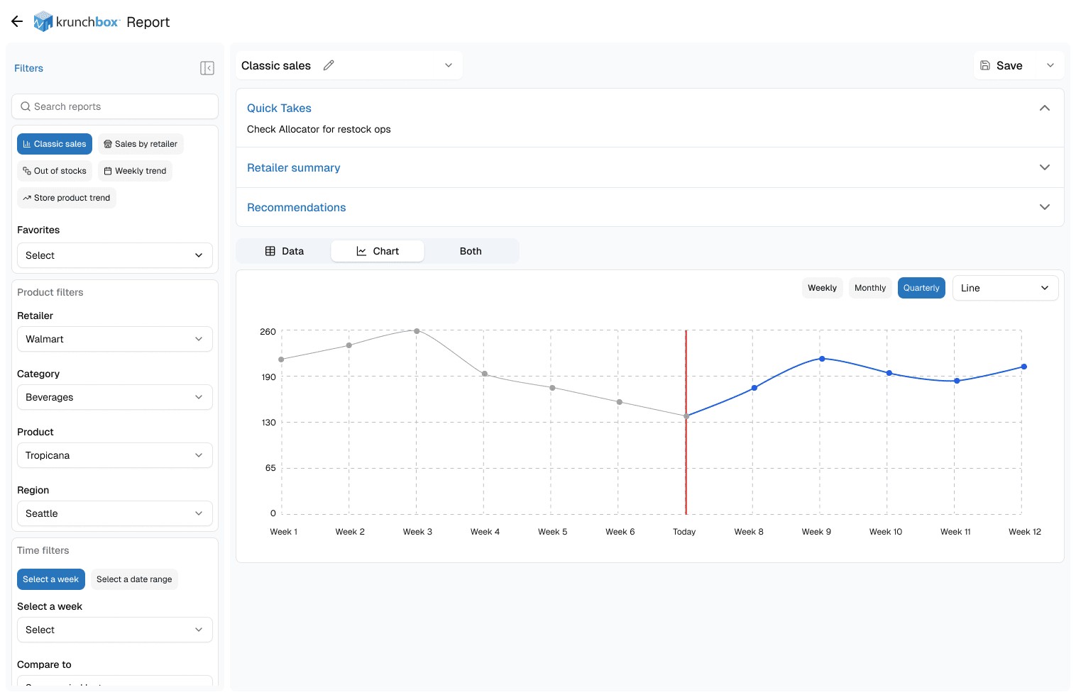
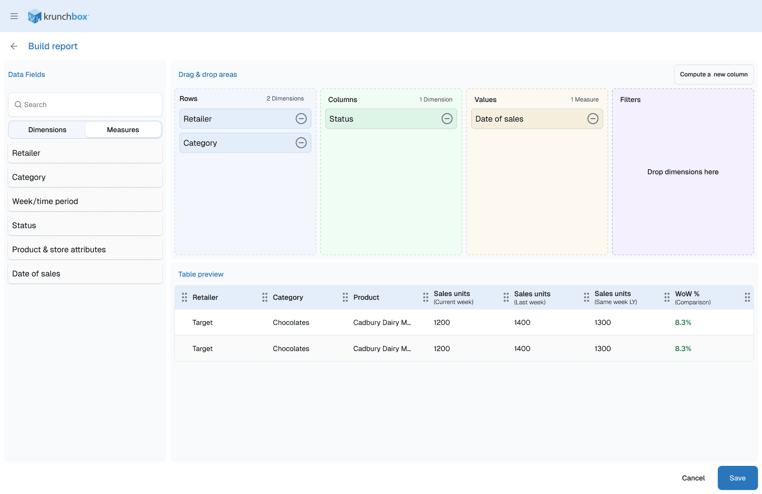
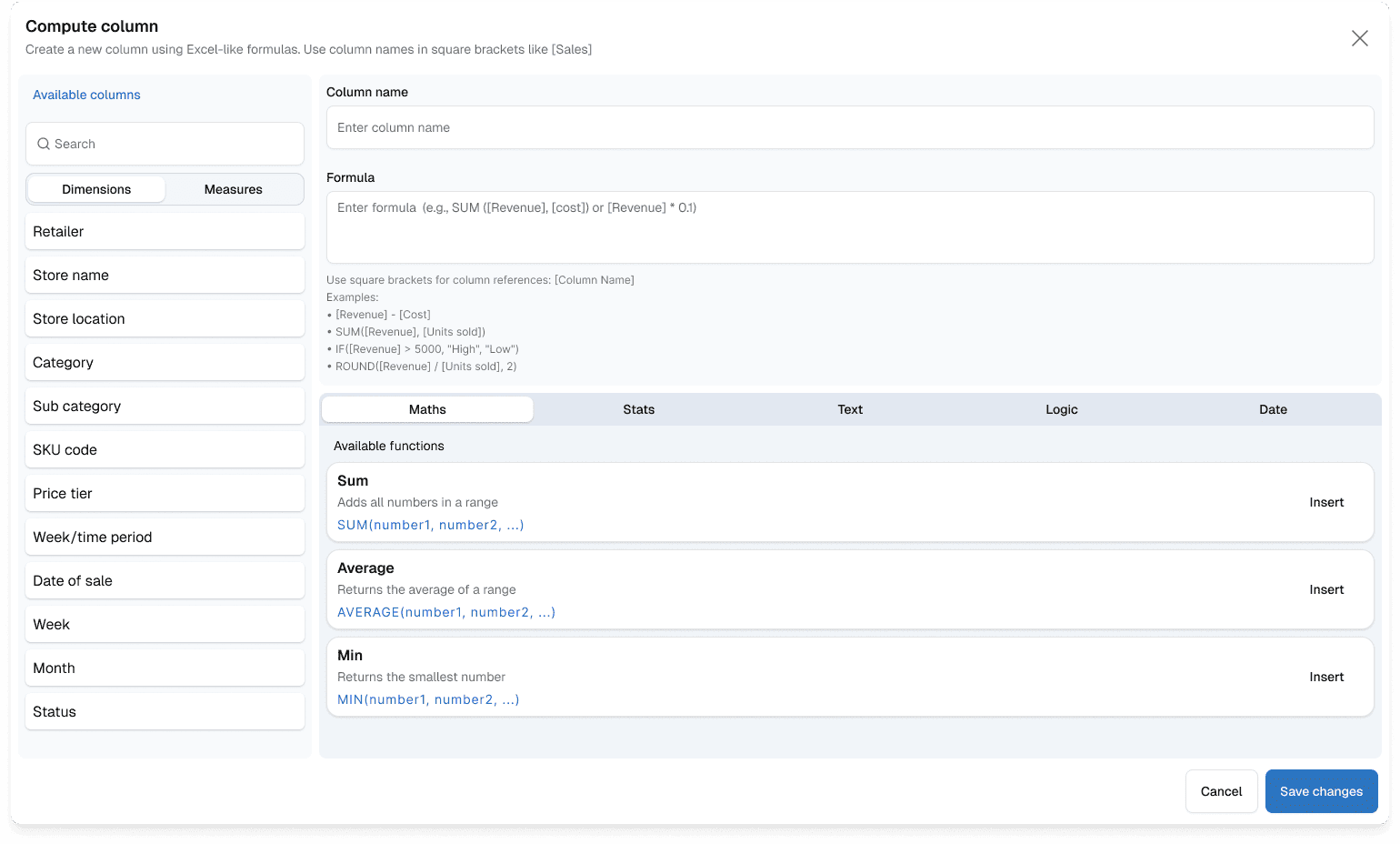
Krunchbox had evolved organically from its early days with a single tenant. New reports were added incrementally to address immediate needs, without a broader structural framework.
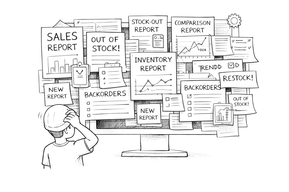
As additional tenants came on board, the number of reports grew rapidly. Over time, this led to two clear issues:
  • An expanding volume of reports with overlapping intent
  • Excessive information presented simultaneously on individual screens
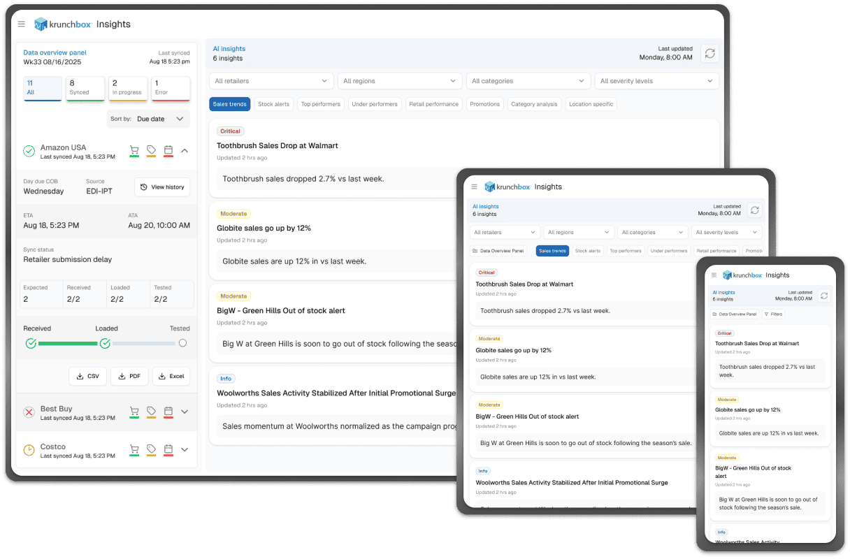
What initially provided flexibility gradually introduced complexity, making it harder for brand tenants to quickly interpret data and focus on what mattered most.
Ad-hoc growth led to fragmented reporting

The First Challenge

Report sprawl reduced clarity

Every tenant question seemed to result in a new report.
Tenant requests resulted in overlapping reports with similar intent.
Finding simple answers often required opening multiple reports.
The system had data in abundance—but no clear starting point.
Each new tenant question resulted in a new report.

The Second Challenge

Too much information shown by default

Filters, tables, and metrics were all visible by default.
Instead of guiding users, the interface asked them to figure out where to begin.
Too much information shown at once

Resetting the Approach

Understanding what tenants actually needed

Before redesigning anything, I spoke directly with tenants to understand their real goals. Rather than asking for features, I focused on daily usage and decision-making needs.

What Tenants Actually Needed

A small, consistent set of questions

Across conversations, the same questions kept coming up:
  • What is selling the most right now?
  • Which retailers are driving those sales?
  • Where are stock-outs likely to happen next?
  • How urgent is replenishment?
  • How is performance trending WoW, MoM, and YoY?
Once these were answered, everything else became secondary.
Listening to tenants clarified real needs.

A Key Insight

Shared needs with occasional exceptions

Most tenant needs were common and predictable.
One-off requirements existed—but shouldn’t define the system.

The Design Direction

Clarity first, flexibility second

The solution focused on:
  • Clear answers upfront
  • Customization only when needed
  • Reduced cognitive load by default

Reducing Report Sprawl

Separating core needs from custom analysis

Reports were reorganized into two layers:
1.  Core Reports
      for common questions.
2.  Custom reports
     for one-off analysis.
This reduced clutter while preserving flexibility.
Core vs custom reporting model.

Simplifying the Interface

Letting the interface guide attention

To reduce overload:
  • Filters moved into a collapsible side panel
  • Sensible defaults were applied
  • Only prioritized information was shown upfront
Details were available—but never forced.
Tenants could now focus on insights first, and details only when needed.

The Dashboard: Answers First

Answers before analysis

A new dashboard became the primary entry point.
Each section answered one key question around sales, stock, or performance.
The goal wasn’t to replace reports—but to reduce the need to search for them.
Designed for quick decisions

Adding AI as an Interpretation Layer

Helping users understand the data

AI translated complex data into clear, plain-language insights.
It surfaced risks, trends, and opportunities—without replacing reports.
Instead of raw metrics, tenants saw:
  • Clear headlines
  • Plain-language insights
  • Direct links to relevant details
This made the platform more accessible without oversimplifying it.
AI as an interpretation layer

The Outcome

From data overload to decision clarity

Krunchbox evolved into a more focused and scalable platform:
  • Fewer reports, used with confidence
  • Lower cognitive load
  • Faster time to insight
Tenants could focus on what to do next, not where to look.
Krunchbox evolved from a report-heavy system into an insight-led platform designed for faster, more confident decisions.

Gallery